
Feature Projects >
Zaney
Zaney
Light MTB eBike
Concept / Brand strategy / Research / Visual identity / CMF / Product graphics / Persona
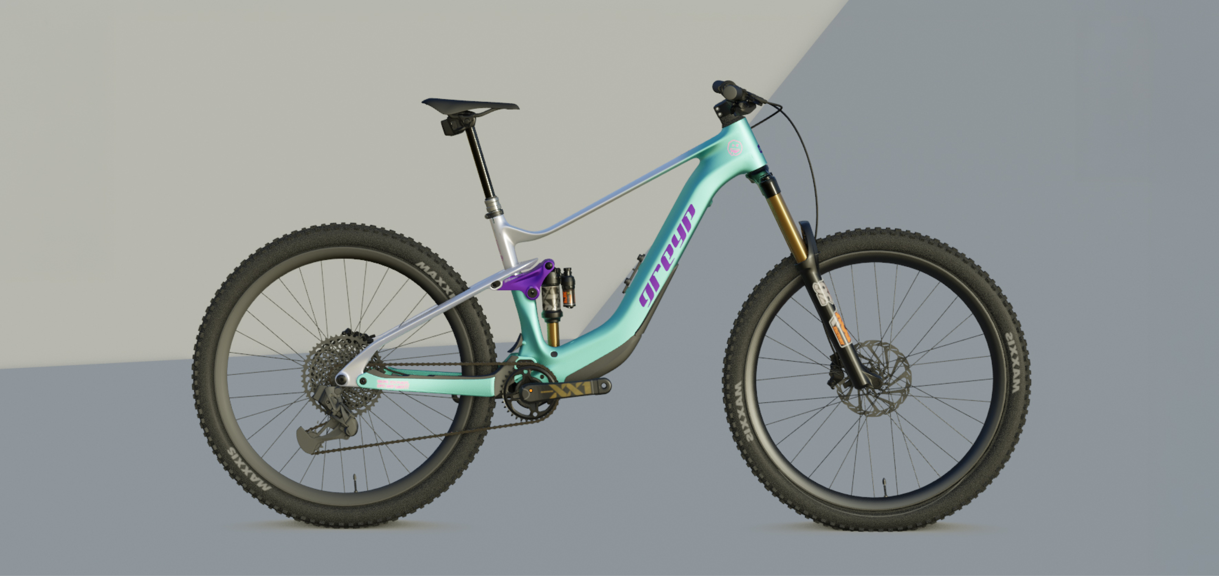
Zaney was developed as a light eMTB with a playful and unconventional character. I worked on the concept and brand direction, from defining the target user and personality of the bike to its colours, decals and overall visual expression.
The Concept
The target was an experienced mountain biker looking for a high-end eMTB with advanced technology, but also a design that feels more personal and distinctive.
The idea was to position Zaney towards riders who are not afraid to stand out.
The Rider
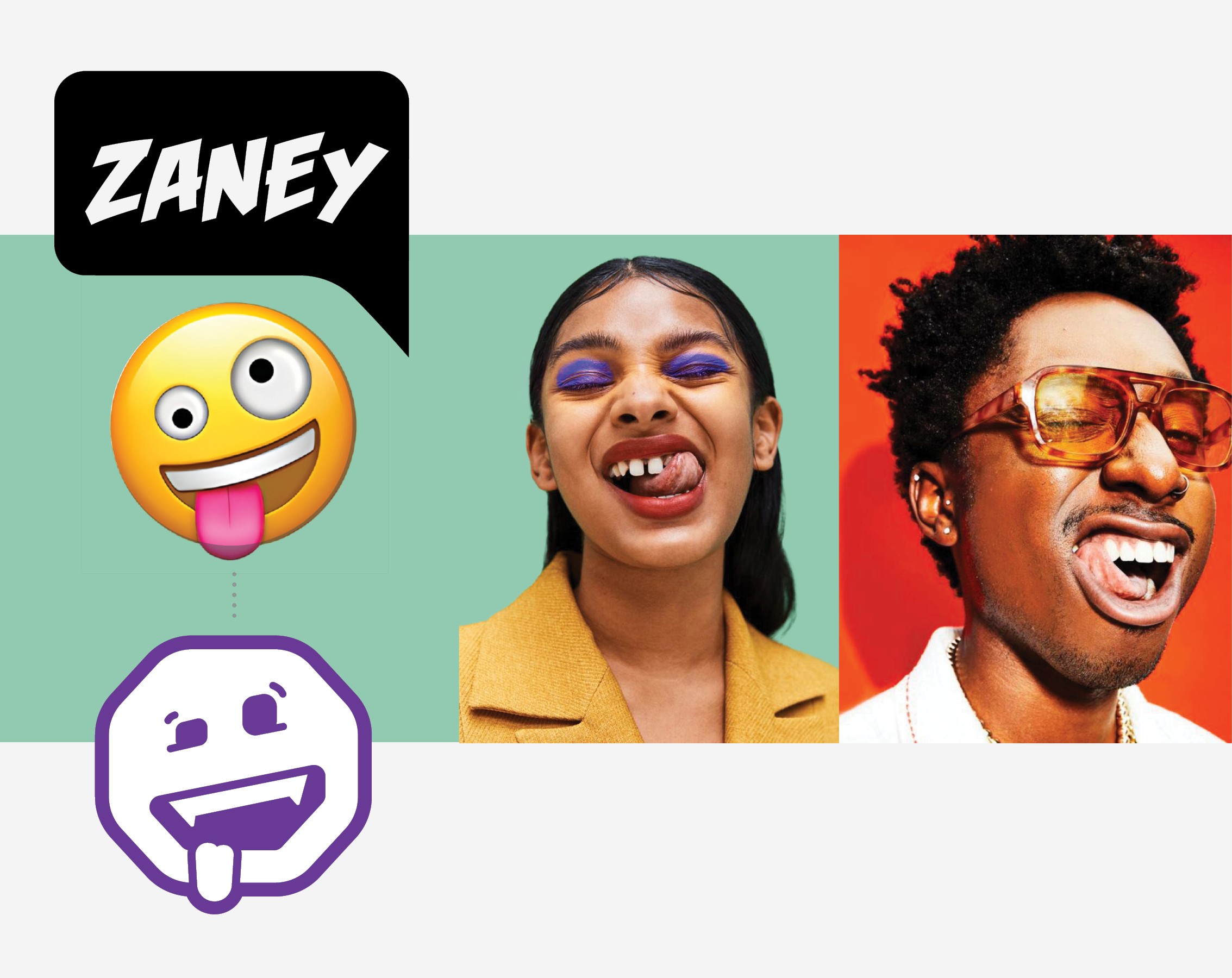
The target was an experienced mountain biker looking for a high-end eMTB with advanced technology, but also a design that feels more personal and distinctive. The idea was to position Zaney towards riders who are not afraid to stand out.
The Shredder, 29 - 45 y
Riding is my escape, a way to relax, improve my skills and enjoy the ride even more with an e-bike.
Quirky scale
We positioned Zaney on the conservative-to-quirky scale, aiming for a more distinctive and expressive character while staying true to its brand values.
From Brand to Bike
The same visual direction was explored across different colourways and extended to the helmet and merchandise, creating a more complete visual world around the bike.
The Zaney Look
The same visual direction was explored across different colourways and extended to the helmet and merchandise, creating a more complete visual world around the bike.
Helmet Design Variations
The Shredder
Style
Unicorn Tears
The Floor is Lava
Black Tie Optional
© 2026 Lidija Janković
Feature Projects >
Zaney
Zaney
Light MTB eBike
Concept / Brand strategy / Research / Visual identity / CMF / Product graphics / Persona
Zaney was developed as a light eMTB with a playful and unconventional character. I worked on the concept and brand direction, from defining the target user and personality of the bike to its colours, decals and overall visual expression.
The Concept
The target was an experienced mountain biker looking for a high-end eMTB with advanced technology, but also a design that feels more personal and distinctive.
The idea was to position Zaney towards riders who are not afraid to stand out.
The Rider
The target was an experienced mountain biker looking for a high-end eMTB with advanced technology, but also a design that feels more personal and distinctive. The idea was to position Zaney towards riders who are not afraid to stand out.
The Shredder, 29 - 45 y
Riding is my escape, a way to relax, improve my skills and enjoy the ride even more with an e-bike.
Quirky scale
We positioned Zaney on the conservative-to-quirky scale, aiming for a more distinctive and expressive character while staying true to its brand values.
From Brand to Bike
The same visual direction was explored across different colourways and extended to the helmet and merchandise, creating a more complete visual world around the bike.
The Zaney Look
The same visual direction was explored across different colourways and extended to the helmet and merchandise, creating a more complete visual world around the bike.
Helmet Design Variations
The Shredder
Style
Unicorn Tears
The Floor is Lava
Black Tie Optional
© 2026 Lidija Janković
Feature Projects >
Zaney
Zaney
Light MTB eBike
Concept / Brand strategy / Research / Visual identity / CMF / Product graphics / Persona
Zaney was developed as a light eMTB with a playful and unconventional character. I worked on the concept and brand direction, from defining the target user and personality of the bike to its colours, decals and overall visual expression.
The Concept
The target was an experienced mountain biker looking for a high-end eMTB with advanced technology, but also a design that feels more personal and distinctive.
The idea was to position Zaney towards riders who are not afraid to stand out.
The Rider
The target was an experienced mountain biker looking for a high-end eMTB with advanced technology, but also a design that feels more personal and distinctive. The idea was to position Zaney towards riders who are not afraid to stand out.
The Shredder, 29 - 45 y
Riding is my escape, a way to relax, improve my skills and enjoy the ride even more with an e-bike.
Quirky scale
We positioned Zaney on the conservative-to-quirky scale, aiming for a more distinctive and expressive character while staying true to its brand values.
From Brand to Bike
The same visual direction was explored across different colourways and extended to the helmet and merchandise, creating a more complete visual world around the bike.
The Zaney Look
The same visual direction was explored across different colourways and extended to the helmet and merchandise, creating a more complete visual world around the bike.
Helmet Design Variations
The Shredder
Style
Unicorn Tears
The Floor is Lava
Black Tie Optional
© 2026 Lidija Janković