
Feature Projects >
Partner Hub >
Hero 4
HERO 4
Designing a learning journey
Training & Certification was designed as more than a place to access learning materials. The experience needed to guide partners through every stage of their certification journey - from getting started, to completing courses, maintaining certification and progressing towards Premium Partner status.
Working together with the Product Owner, Design Lead and another UX designer, I contributed to defining the different user states, training behavior and content priorities, ensuring users always understood where they were in the process and what to do next. The behavior of training cards, personalized messages and certification states was documented to create a consistent experience across the platform.
01 — Designing the certification journey
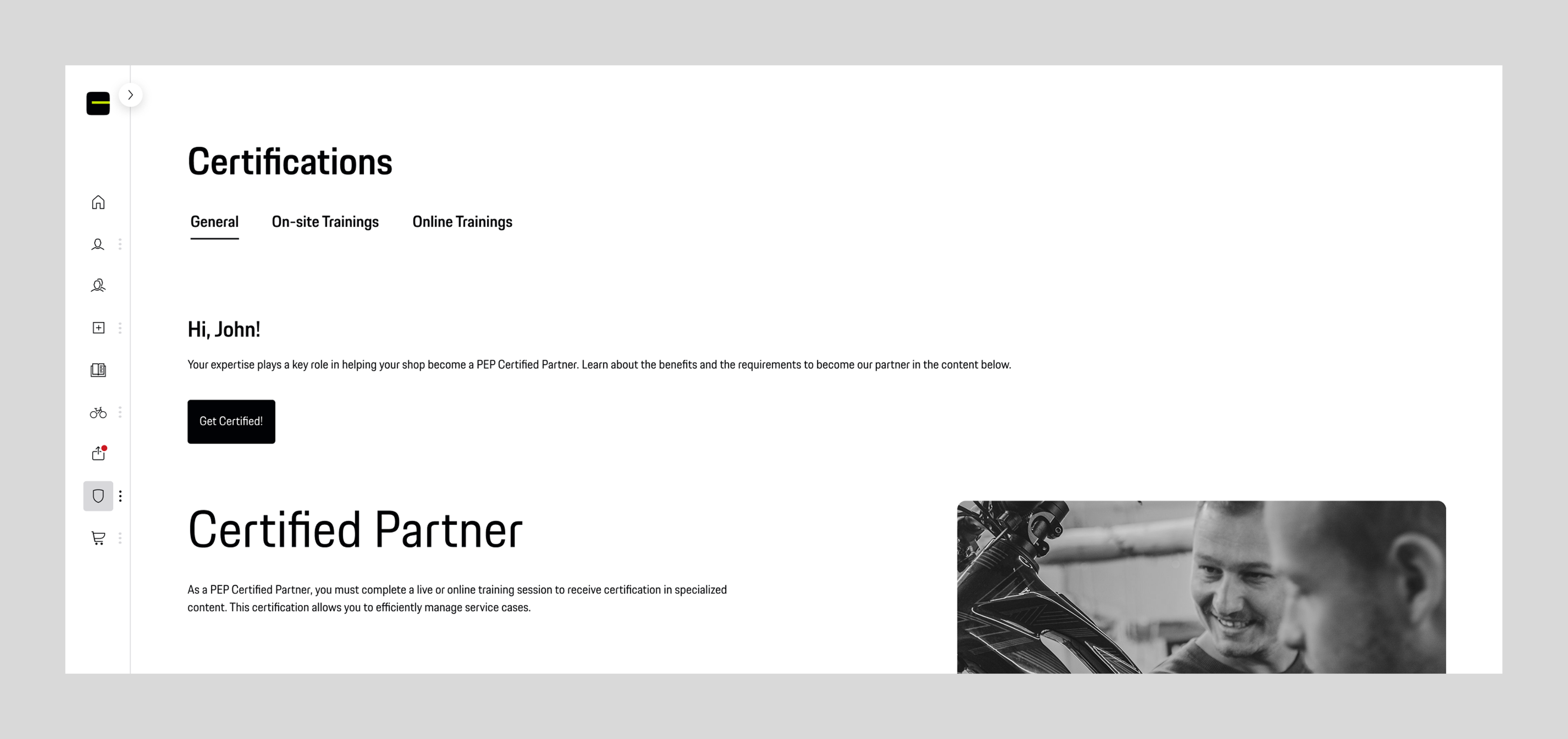
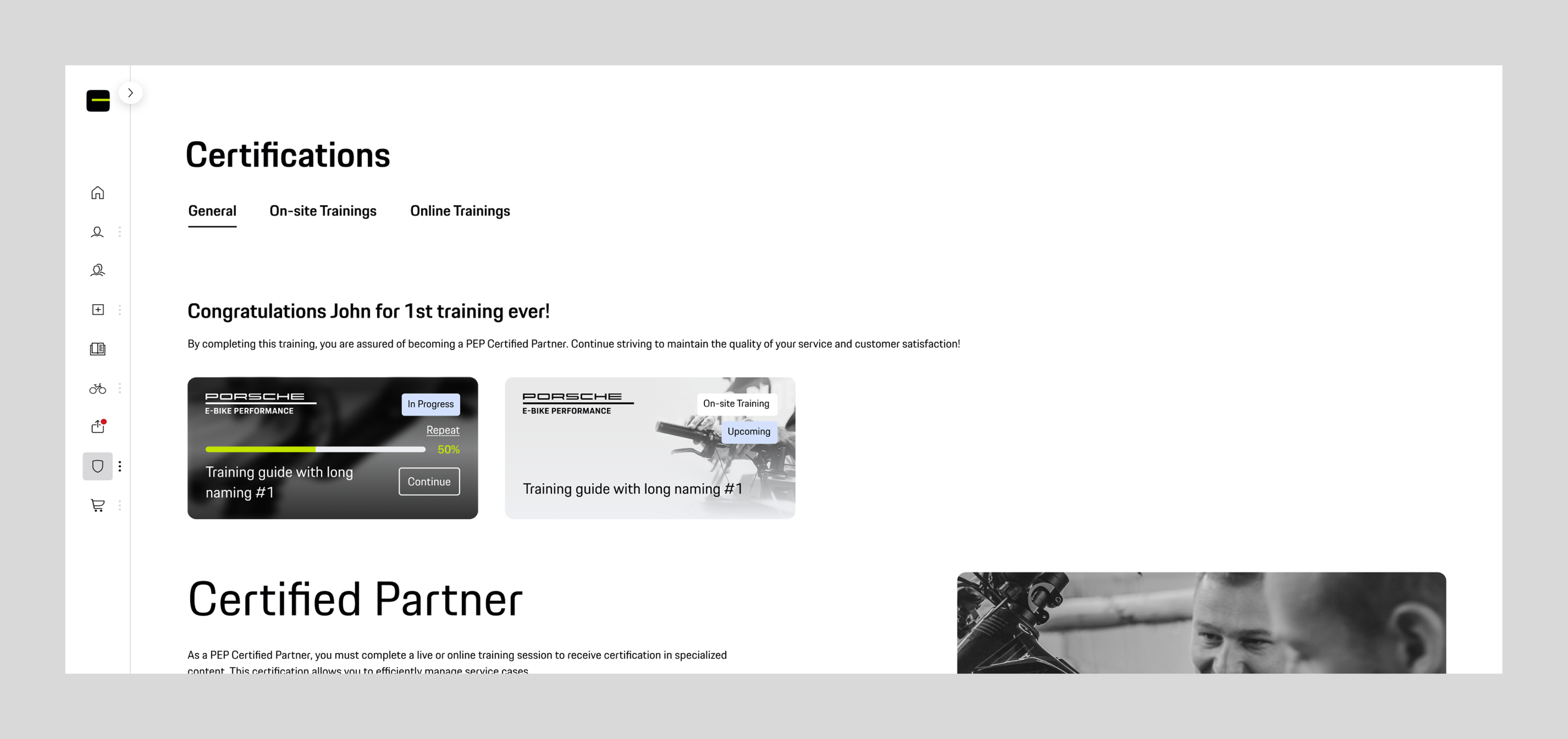
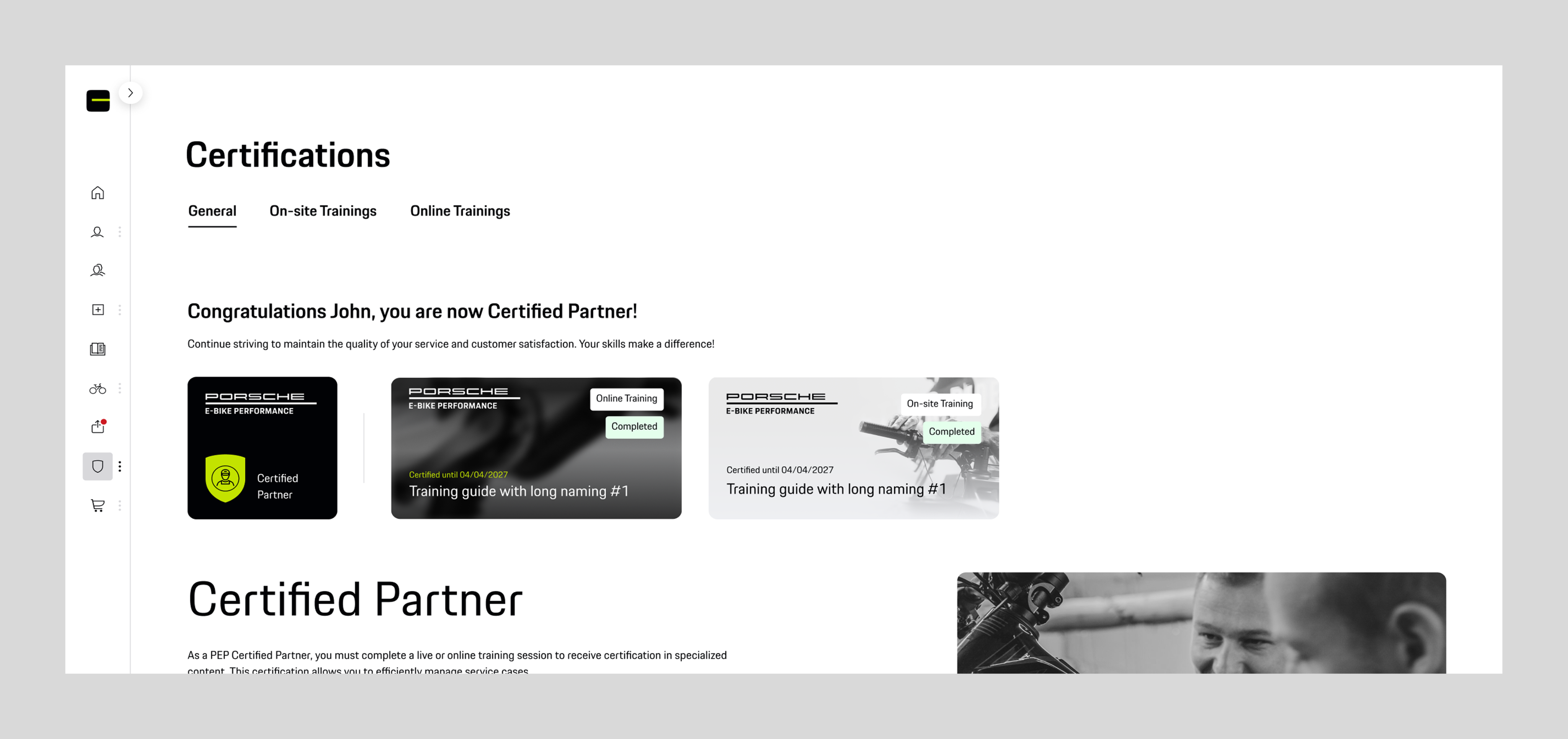
Instead of presenting the same content to every user, the experience evolved together with their progress. Depending on their certification status, users were greeted with different messages, available actions, benefits and training recommendations.
The goal was to make every stage feel meaningful - encouraging new partners to begin their first training, recognizing achievements as they progressed and motivating them to continue learning beyond their initial certification. The interface gradually shifted from onboarding to long-term engagement rather than treating certification as a one-time milestone.
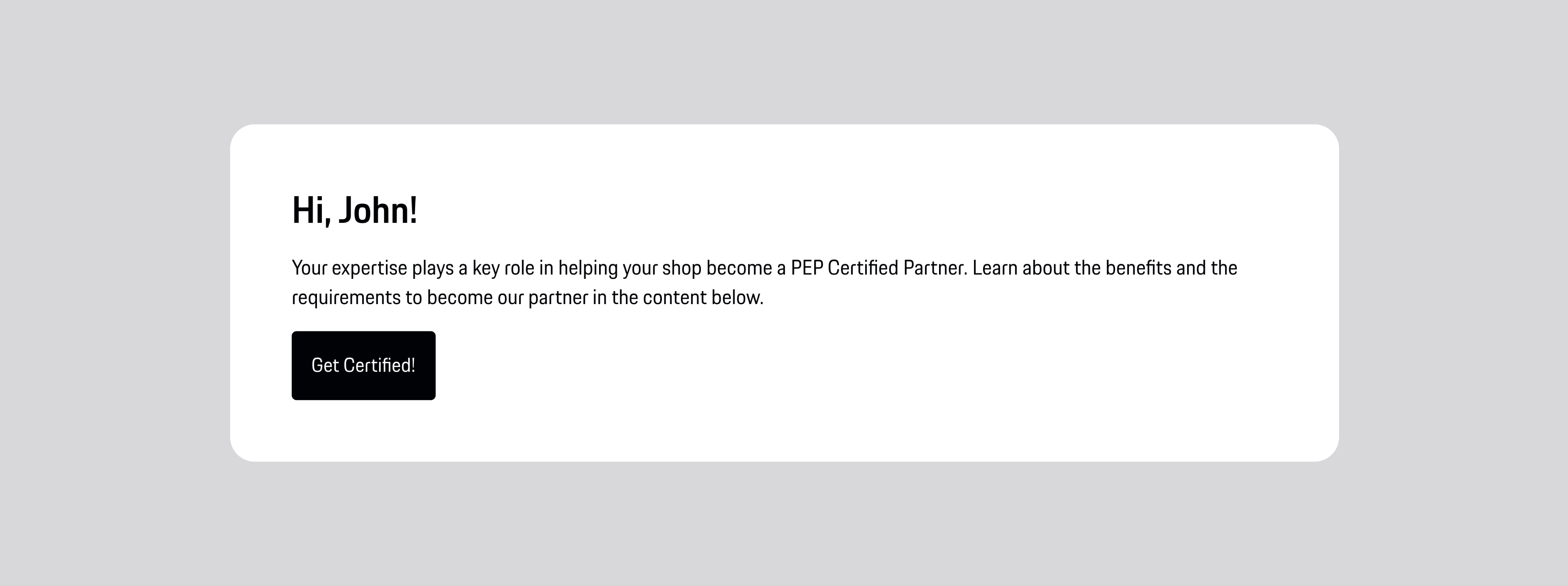
1. Basic Partner
"Get Certified" | Initial benefits
First CTA
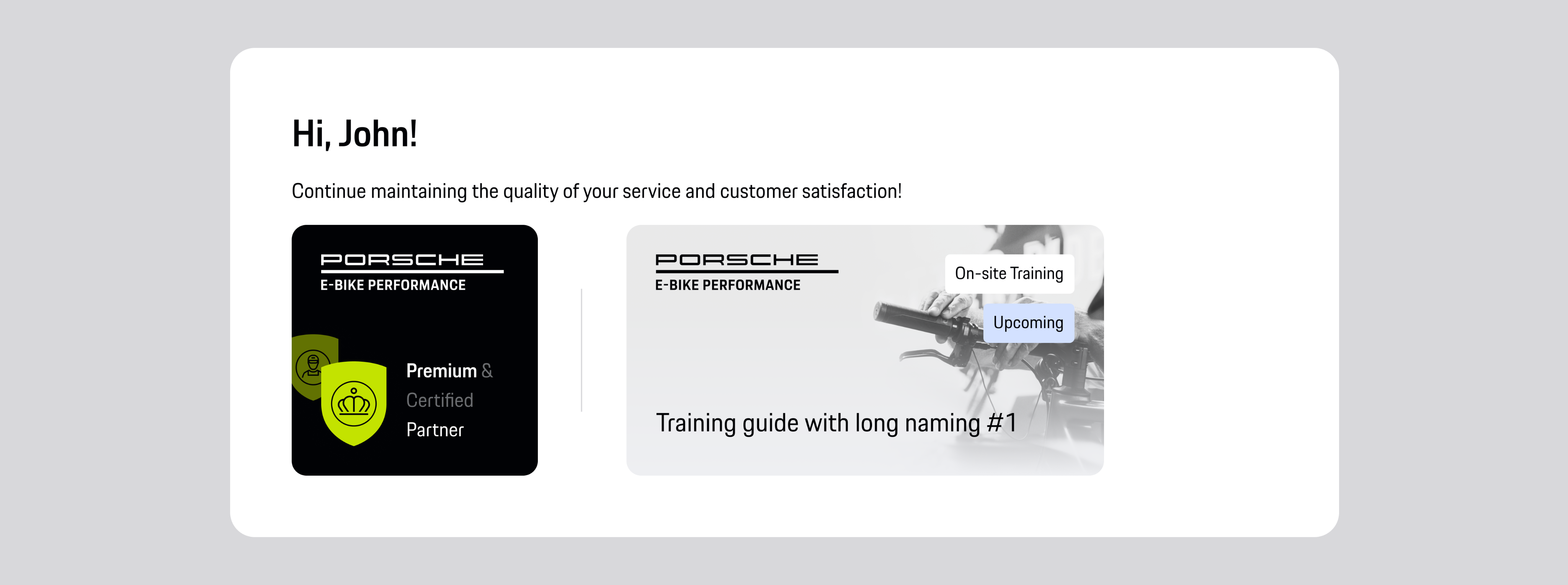
2. First Training Started
Congratulations | In Progress | Continue
Upcoming Training
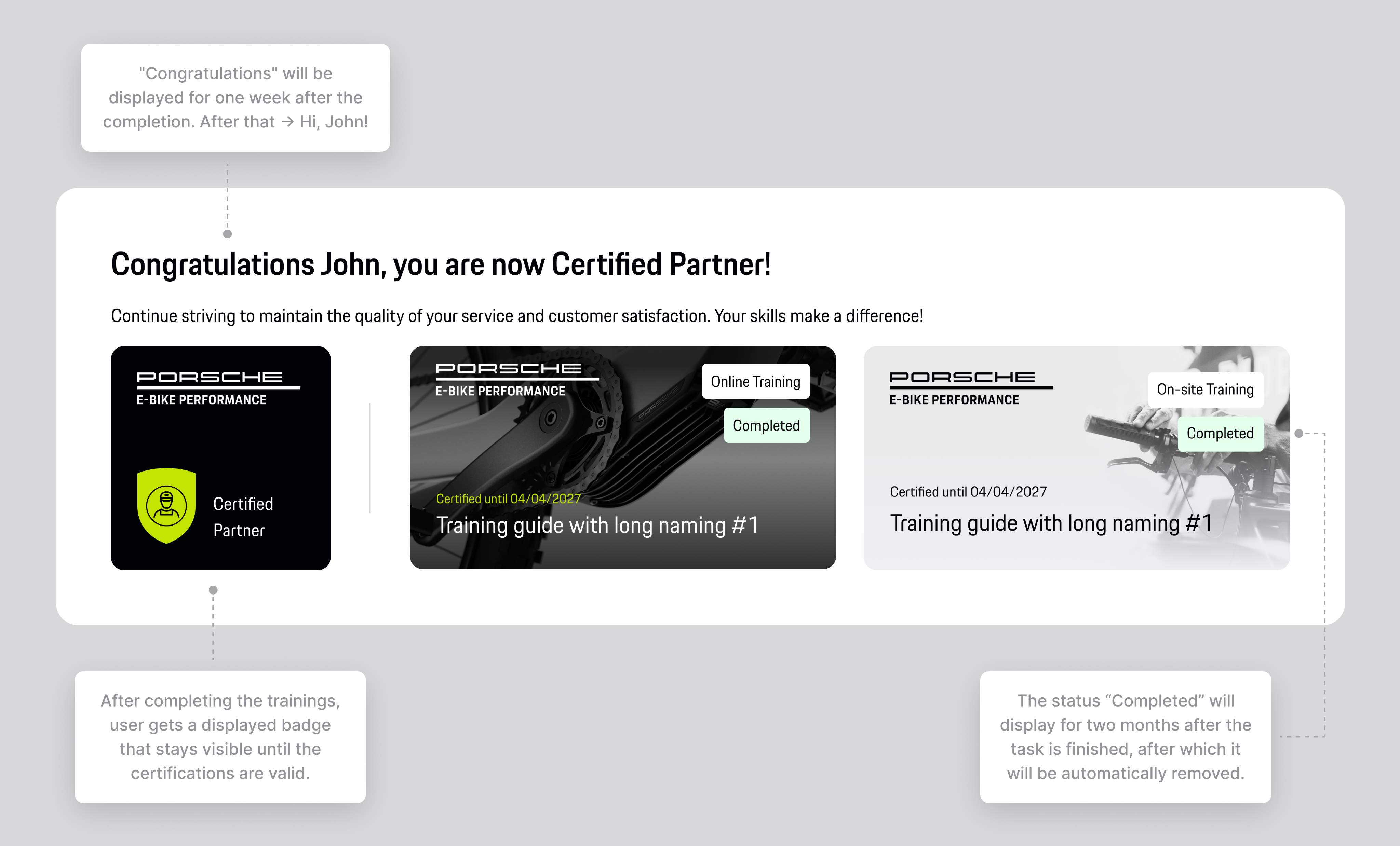
3. Certified Partner
Congratulations | Completed | Certified badge
Next learning opportunities
02 — Defining card behavior and content priority
Designing the interface wasn't just about creating individual cards. It was about defining how the experience should evolve as users progressed.
Together with the team, we established clear rules for which training cards should appear first, how different training states were prioritized and when information became less relevant. Active and upcoming trainings always received priority, while completed courses gradually moved aside as users progressed.
Cards behavior
certification badge is always displayed (if the user owns one)
showing first → In Progress online cards
showing second → Upcoming on-site cards
showing third → Expired cards
showing fourth
→ Certified Until Cards (for 2 months each)
showing when no activity after 2 months of no trainings
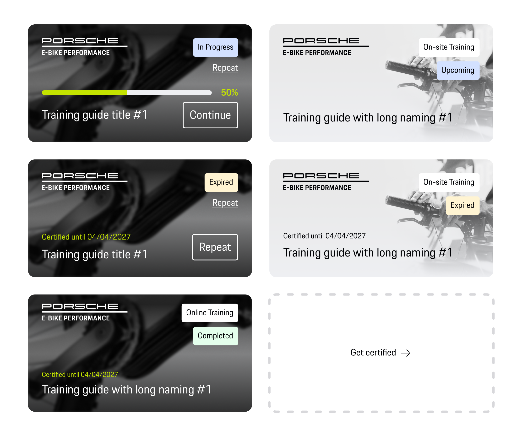
We also defined when congratulation messages appeared, how certification badges were introduced and how the homepage evolved after users completed key milestones. This ensured the interface continuously reflected what mattered most at each stage of the learning journey rather than displaying every piece of information equally.
Basic partner [No certification yet]
Premium partner [On-site training booked]
Certified partner [After the 1st training]
03 — Supporting users throughout training
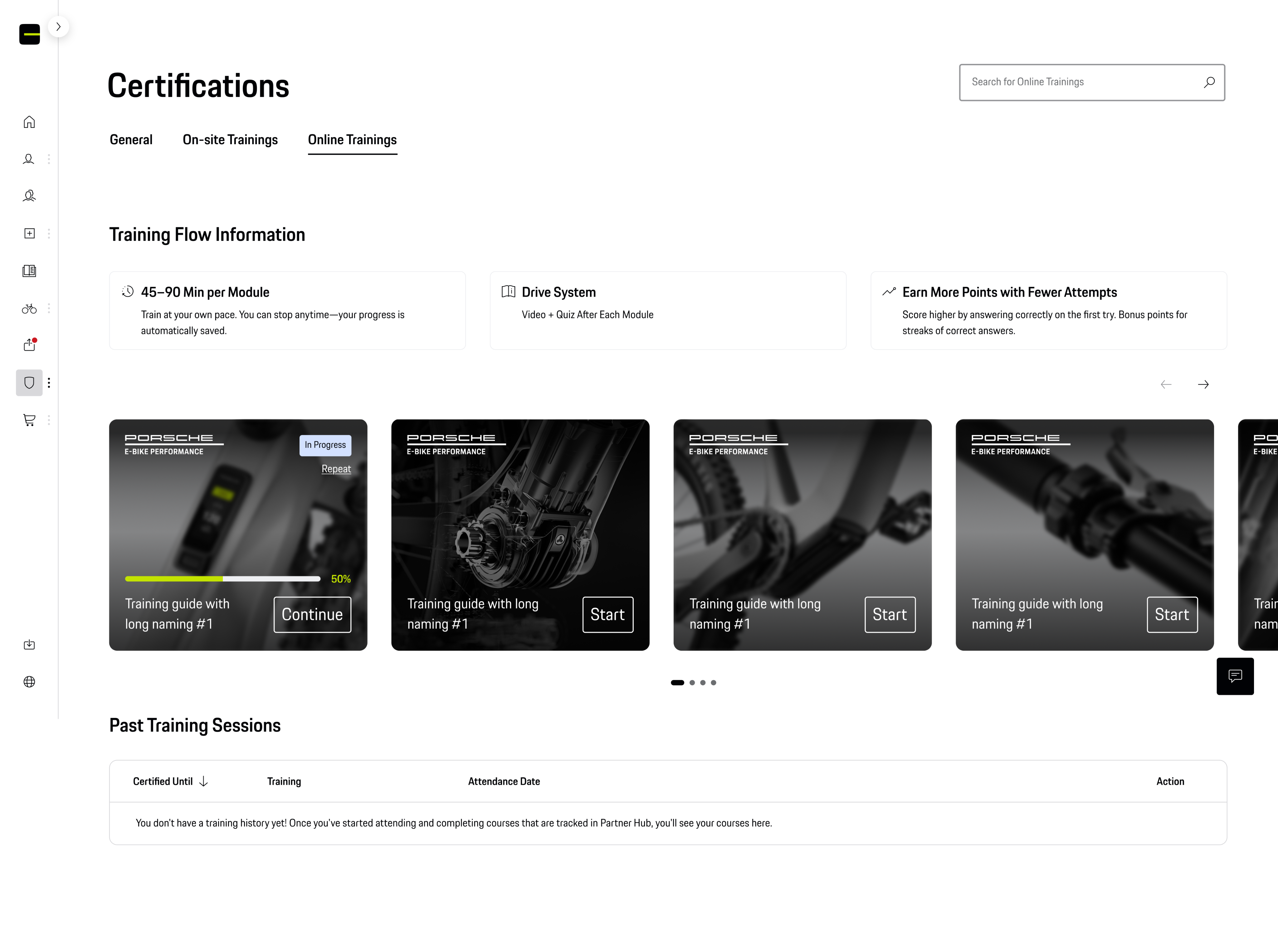
The training experience was designed to keep users engaged and make learning easy to follow.
Each course clearly explained its structure, duration and progress, while users could pause and continue at any time. Ongoing trainings, upcoming sessions and completed certifications were brought together in one place, giving users a clear overview of both their current progress and learning history.

Key Outcomes
- Designed a certification journey that adapts to each user's progress.
- Defined behavior and priority rules for training cards and certification states.
- Created a learning experience that supports continuous engagement beyond completing a single course.
Reflection
This project was an important step in my journey from graphic design to product design. It showed me that the most rewarding part of design isn't creating screens—it's understanding problems, working with others to solve them and making complex experiences feel simple.
Looking back, that's what I enjoyed most throughout this project, and it's the dirAll flows, screens and states were finalized and handed off to development, with a complete design system supporting future scaling of the platform across partner roles.
This project was an important step in my journey from graphic design to product design. It showed me that the most rewarding part of design isn't creating screens—it's understanding problems, working with others to solve them and making complex experiences feel simple.
Looking back, that's what I enjoyed most throughout this project, and it's the direction I want to continue growing in as a Product Designer.ection I want to continue growing in as a Product Designer.
© 2026 Lidija Janković
Feature Projects >
Partner Hub >
Hero 4
HERO 4
Designing a learning journey
Training & Certification was designed as more than a place to access learning materials. The experience needed to guide partners through every stage of their certification journey - from getting started, to completing courses, maintaining certification and progressing towards Premium Partner status.
Working together with the Product Owner, Design Lead and another UX designer, I contributed to defining the different user states, training behavior and content priorities, ensuring users always understood where they were in the process and what to do next. The behavior of training cards, personalized messages and certification states was documented to create a consistent experience across the platform.
01 — Designing the certification journey
Instead of presenting the same content to every user, the experience evolved together with their progress. Depending on their certification status, users were greeted with different messages, available actions, benefits and training recommendations.
The goal was to make every stage feel meaningful - encouraging new partners to begin their first training, recognizing achievements as they progressed and motivating them to continue learning beyond their initial certification. The interface gradually shifted from onboarding to long-term engagement rather than treating certification as a one-time milestone.
1. Basic Partner
"Get Certified" | Initial benefits
First CTA
2. First Training Started
Congratulations | In Progress | Continue
Upcoming Training
3. Certified Partner
Congratulations | Completed | Certified badge
Next learning opportunities
02 — Defining card behavior and content priority
Designing the interface wasn't just about creating individual cards. It was about defining how the experience should evolve as users progressed.
Together with the team, we established clear rules for which training cards should appear first, how different training states were prioritized and when information became less relevant. Active and upcoming trainings always received priority, while completed courses gradually moved aside as users progressed.
Cards behavior
certification badge is always displayed (if the user owns one)
showing first → In Progress online cards
showing second → Upcoming on-site cards
showing third → Expired cards
showing fourth → Certified Until Cards (for 2 months each)
showing when no activity after 2 months of no trainings
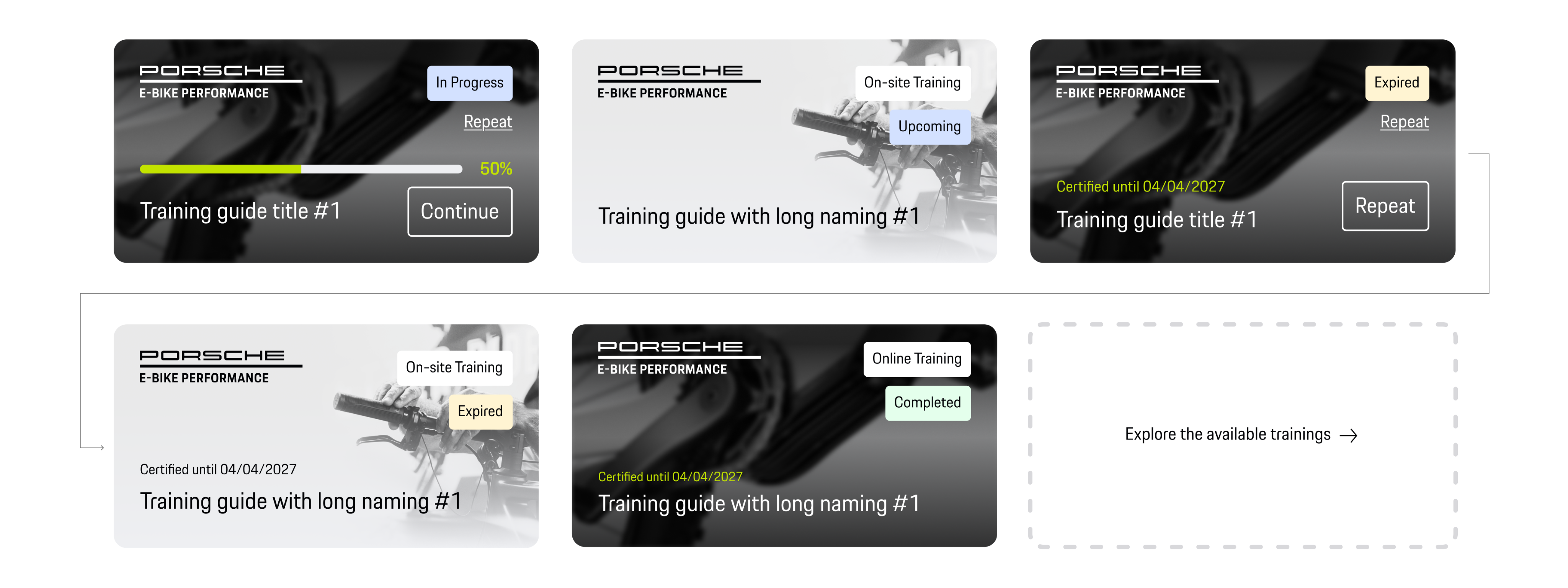
We also defined when congratulation messages appeared, how certification badges were introduced and how the homepage evolved after users completed key milestones. This ensured the interface continuously reflected what mattered most at each stage of the learning journey rather than displaying every piece of information equally.
Basic partner [No certification yet]
Premium partner [On-site training booked]
Certified partner [After the 1st training]
03 — Supporting users throughout training
The training experience was designed to keep users engaged and make learning easy to follow.
Each course clearly explained its structure, duration and progress, while users could pause and continue at any time. Ongoing trainings, upcoming sessions and completed certifications were brought together in one place, giving users a clear overview of both their current progress and learning history.
Key Outcomes
- Designed a certification journey that adapts to each user's progress.
- Defined behavior and priority rules for training cards and certification states.
- Created a learning experience that supports continuous engagement beyond completing a single course.
Reflection
This project was an important step in my journey from graphic design to product design. It showed me that the most rewarding part of design isn't creating screens—it's understanding problems, working with others to solve them and making complex experiences feel simple.
Looking back, that's what I enjoyed most throughout this project, and it's the dirAll flows, screens and states were finalized and handed off to development, with a complete design system supporting future scaling of the platform across partner roles.
This project was an important step in my journey from graphic design to product design. It showed me that the most rewarding part of design isn't creating screens—it's understanding problems, working with others to solve them and making complex experiences feel simple.
Looking back, that's what I enjoyed most throughout this project, and it's the direction I want to continue growing in as a Product Designer.ection I want to continue growing in as a Product Designer.
© 2026 Lidija Janković
Feature Projects >
Partner Hub >
Hero 4
HERO 4
Designing a learning journey
Training & Certification was designed as more than a place to access learning materials. The experience needed to guide partners through every stage of their certification journey - from getting started, to completing courses, maintaining certification and progressing towards Premium Partner status.
Working together with the Product Owner, Design Lead and another UX designer, I contributed to defining the different user states, training behavior and content priorities, ensuring users always understood where they were in the process and what to do next. The behavior of training cards, personalized messages and certification states was documented to create a consistent experience across the platform.
01 — Designing the certification journey
Instead of presenting the same content to every user, the experience evolved together with their progress. Depending on their certification status, users were greeted with different messages, available actions, benefits and training recommendations.
The goal was to make every stage feel meaningful - encouraging new partners to begin their first training, recognizing achievements as they progressed and motivating them to continue learning beyond their initial certification. The interface gradually shifted from onboarding to long-term engagement rather than treating certification as a one-time milestone.
1. Basic Partner
"Get Certified" | Initial benefits
First CTA
2. First Training Started
Congratulations | In Progress | Continue
Upcoming Training
3. Certified Partner
Congratulations | Completed | Certified badge
Next learning opportunities
02 — Defining card behaviour and content priority
Designing the interface wasn't just about creating individual cards. It was about defining how the experience should evolve as users progressed.
Together with the team, we established clear rules for which training cards should appear first, how different training states were prioritized and when information became less relevant. Active and upcoming trainings always received priority, while completed courses gradually moved aside as users progressed.
Cards behavior
certification badge is always displayed (if the user owns one)
showing first → In Progress online cards
showing second → Upcoming on-site cards
showing third → Expired cards
showing fourth → Certified Until Cards (for 2 months each)
showing when no activity after 2 months of no trainings
Available trainings
We also defined when congratulation messages appeared, how certification badges were introduced and how the homepage evolved after users completed key milestones. This ensured the interface continuously reflected what mattered most at each stage of the learning journey rather than displaying every piece of information equally.
Basic partner [No certification yet]
Premium partner [On-site training booked]
Certified partner [After the 1st training]
03 — Supporting users throughout training
The training experience was designed to keep users engaged and make learning easy to follow.
Each course clearly explained its structure, duration and progress, while users could pause and continue at any time. Ongoing trainings, upcoming sessions and completed certifications were brought together in one place, giving users a clear overview of both their current progress and learning history.
Key Outcomes
- Designed a certification journey that adapts to each user's progress.
- Defined behaviour and priority rules for training cards and certification states.
- Created a learning experience that supports continuous engagement beyond completing a single course.
Reflection
This project was an important step in my journey from graphic design to product design. It showed me that the most rewarding part of design isn't creating screens—it's understanding problems, working with others to solve them and making complex experiences feel simple.
Looking back, that's what I enjoyed most throughout this project, and it's the dirAll flows, screens and states were finalized and handed off to development, with a complete design system supporting future scaling of the platform across partner roles.
This project was an important step in my journey from graphic design to product design. It showed me that the most rewarding part of design isn't creating screens—it's understanding problems, working with others to solve them and making complex experiences feel simple.
Looking back, that's what I enjoyed most throughout this project, and it's the direction I want to continue growing in as a Product Designer.ection I want to continue growing in as a Product Designer.
© 2026 Lidija Janković