
Feature Projects >
Partner Hub >
Hero 3
HERO 3
Simplifying bike brand selection
This exploration focused on refining a small but important part of the registration experience. Through several iterations, we looked for a solution that kept the interaction clear and easy to use.
The Challange
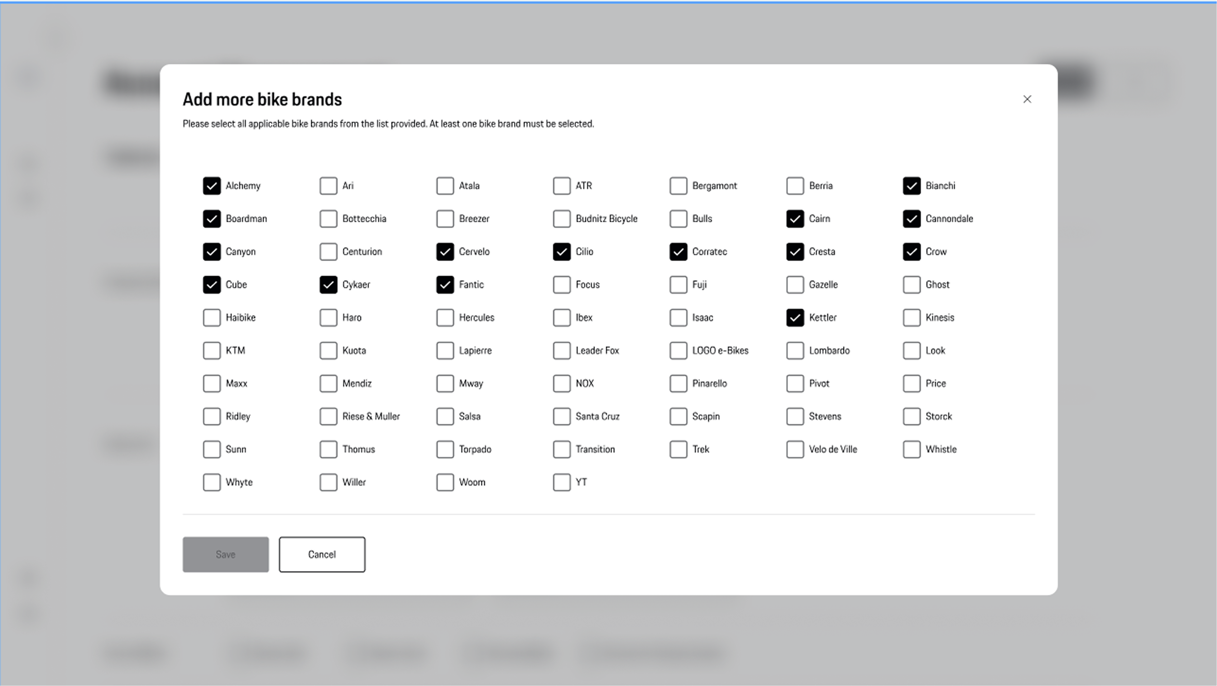
During registration, partners needed to select the bike brands they worked with. With around 67 available brands, the challenge wasn't adding more functionality, but making a long list easier to navigate.
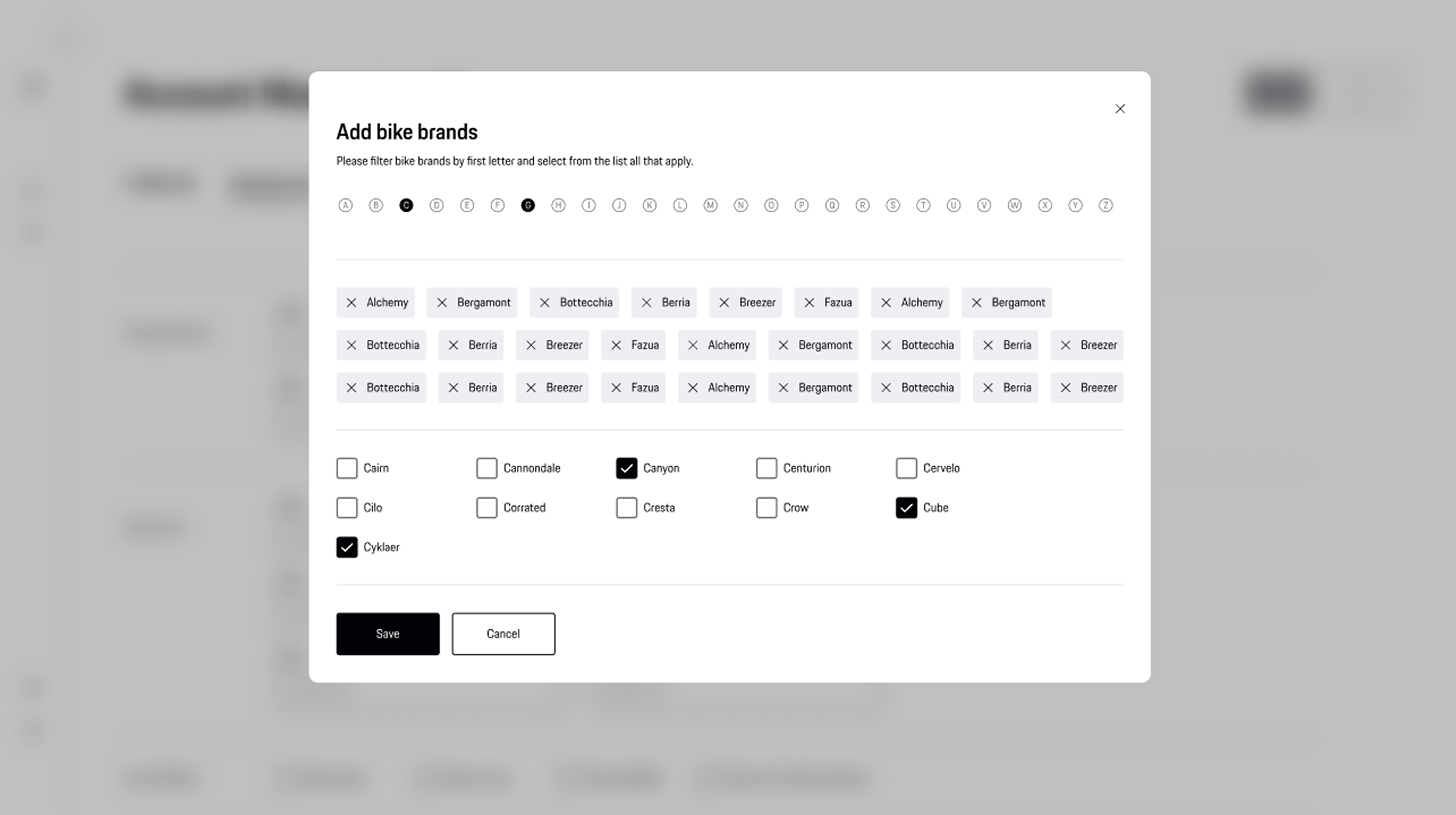
We explored different ways of helping users manage multiple selections. One iteration displayed selected brands as tags inside the modal, making the selection visible while users continued browsing. As we refined the experience, we realized those tags duplicated information already shown after completing the step and added unnecessary visual clutter.
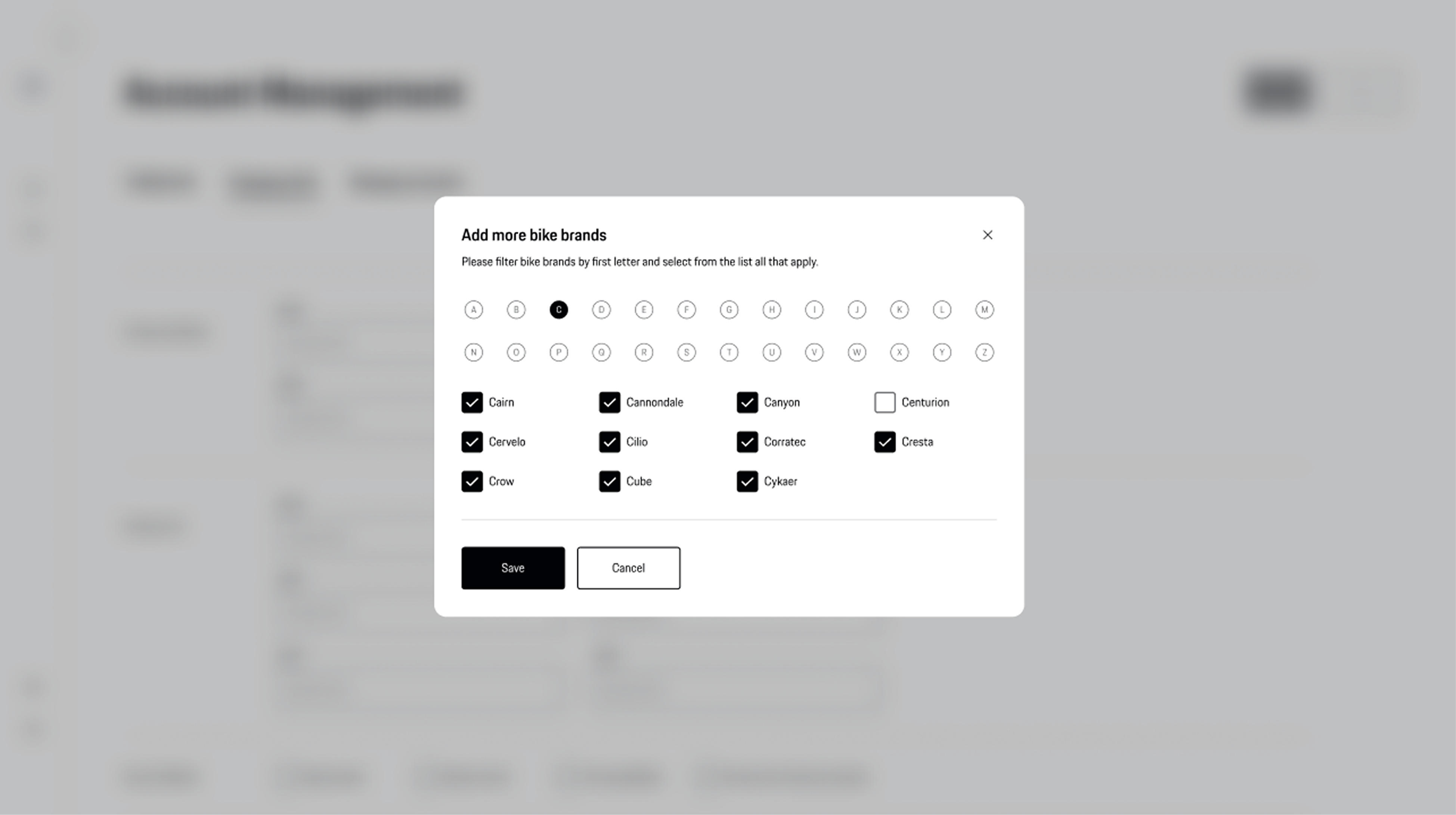
The final solution kept the alphabetical filter while removing the extra tags, resulting in a cleaner interface that allowed users to focus on the task without additional distractions.
V2
Selected brands were displayed as tags while users continued making selections.
Finnal
The final solution removed the tags and relied on alphabetical filtering, reducing visual clutter while keeping the interaction simple.

Key decision
We removed selected tags because they repeated information already available in the registration flow. Keeping only the alphabetical filter created a cleaner and more focused experience.
© 2026 Lidija Janković
Feature Projects >
Partner Hub >
Hero 3
HERO 3
Simplifying bike brand selection
This exploration focused on refining a small but important part of the registration experience. Through several iterations, we looked for a solution that kept the interaction clear and easy to use.
The Challange
During registration, partners needed to select the bike brands they worked with. With around 67 available brands, the challenge wasn't adding more functionality, but making a long list easier to navigate.
We explored different ways of helping users manage multiple selections. One iteration displayed selected brands as tags inside the modal, making the selection visible while users continued browsing. As we refined the experience, we realized those tags duplicated information already shown after completing the step and added unnecessary visual clutter.
The final solution kept the alphabetical filter while removing the extra tags, resulting in a cleaner interface that allowed users to focus on the task without additional distractions.
V1
V2
Selected brands were displayed as tags while users continued making selections.
Finnal
The final solution removed the tags and relied on alphabetical filtering, reducing visual clutter while keeping the interaction simple.
Key decision
We removed selected tags because they repeated information already available in the registration flow. Keeping only the alphabetical filter created a cleaner and more focused experience.
© 2026 Lidija Janković
Feature Projects >
Partner Hub >
Hero 3
HERO 3
Simplifying bike brand selection
This exploration focused on refining a small but important part of the registration experience. Through several iterations, we looked for a solution that kept the interaction clear and easy to use.
The Challange
During registration, partners needed to select the bike brands they worked with. With around 67 available brands, the challenge wasn't adding more functionality, but making a long list easier to navigate.
We explored different ways of helping users manage multiple selections. One iteration displayed selected brands as tags inside the modal, making the selection visible while users continued browsing. As we refined the experience, we realized those tags duplicated information already shown after completing the step and added unnecessary visual clutter.
The final solution kept the alphabetical filter while removing the extra tags, resulting in a cleaner interface that allowed users to focus on the task without additional distractions.
V1
V2
Selected brands were displayed as tags while users continued making selections.
Finnal
The final solution removed the tags and relied on alphabetical filtering, reducing visual clutter while keeping the interaction simple.
Key decision
We removed selected tags because they repeated information already available in the registration flow. Keeping only the alphabetical filter created a cleaner and more focused experience.
© 2026 Lidija Janković